Response to Feltron Reports

I read the 2009 and 2010 Feltron reports for this week. I felt the information was poorly presented and confusing. I liked the idea of gathering data on daily activities from the 2009 report but the charts and text in the reports were poorly done. There was a lot of information presented as well and I feel like he might have been better served omitting some data so that the information was easier to follow.

The 2010 report was much worse than the 2009 report as well. I liked the idea in 2009 to track daily activities and was able to see what kind of person this man was (an alcoholic) and was hoping for more of the same. By keeping the same format for the two reports we would have been able to track change in activity over time but when he decided to completely change the information and presentation overall it led to another confusing and wasted presentation. The 2010 report was focused on his life and the events that he was a part of. This included where he travelled throughout his life. The line map was interesting but the information was not something I was looking for after reading the 2009 report. The most interesting part to me was the index. He listed museums he had visited and movies he had seen aloing with other random facts about himself. I’m sure that was not intended by the presenter but the rest of the report was poorly organized in my opinion.

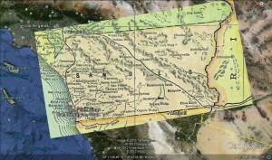
Maps on Google Earth

For our practice we were asked to take a historical map and place it over the Google Earth maps. It was pretty easy. After finding a map, which was the hardest part, I simply saved it and opened Google Earth. After that I placed the map down and looked at the border of Mexico to begin aligning my maps. Shortly after adjusting so that the border’s lined up on both maps I had to zoom out. I needed to do this to stretch the map out because San Diego county is actually pretty big. After stretching it out to fit, I lined it up with the ocean and the border of Arizona. San Diego county doesn’t stretch out to Arizona now so I learned that it actually used to which is interesting on its own. The last thing I used to align the maps was the river and that’s how I got the maps to match!

Struggling with embedding charts

For this week we have been asked to make a chart and a map for Wednesday. I went into the HTML version to insert this chart. It’s a new thing for me so I was surprised to figure out that I was actually able to do it because I’m not exactly computer savvy. The embedding the map was easy. I keep getting the chart to mess up though which is awkward. It allows me to view it until I save it. If anyone has an answer on how to fix it I would appreciate it. Thanks
Chart


View Places I Go in a larger map

Security Self Evaluation

I missed class on Monday and more than likely more tips on how to protect myself from a cyber attack. Before reading the articles I had always though that I was pretty safe. The assignment for Wednesday is to do a self evaluation on our own security preactices. I’ll have to be honest and say that I would rate myself poorly with my digital security practices. These are a few things which are making me vulnerable:

  1. I do use some plaintext passwords
  2. I daisychain some of my accounts
  3. I do not update my antivirus often
  4. I do not backup anything online or onto a seperate hard drive

I’m not sure if these things will ever change considering I have very little to protect other than identity theft. I have no sentimental items or work that I am afraid of losing so backing up files has never been needed in m opinion. I can definitely change the way I handle my passwords though and will probably change them when I get a chance.